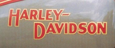
As Harley-Davidson motorcycles changed, so did their tank logos. See the evolution of Harley's tank logos and find out which ones Harley fans loved and hated. Above, the early logos show the trademark colors -- they were altered occasionally, but the same basic lettering was used on Harley tanks for over three decades.
Advertisement
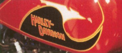
The first change to the Harley-Davidson logo appeared in 1933, when a bird-like scroll surrounded the usual lettering.
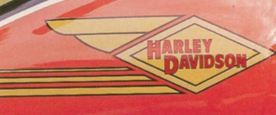
The "bird" motif lasted only a year and was replaced by the "flying diamond" design in 1934.
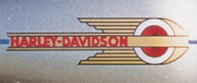
With the new Knucklehead engine came a new tank logo in 1936. Though it lasted only through 1939, a similar design has appeared on some recent models.
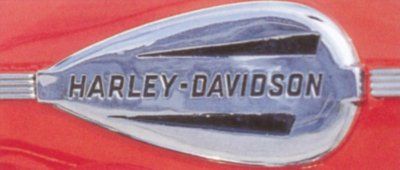
In 1940, Harley introduced its first metal logo, which was used until 1946. Because World War II interrupted its tenure, relatively few motorcycles carried this logo. However, a near-copy is worn by the current 1940s-retro Old Boy.
Advertisement
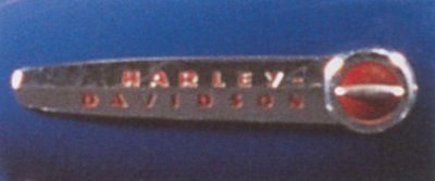
Used from 1947-1950, this simple design ushered out the Knucklehead and ushered in the Panhead -- and the Hydra-Glide.
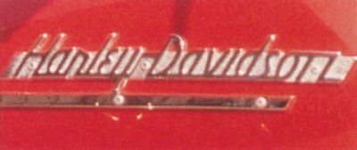
1951-1954: Arguably among the best of Harley's tank logos, this classic script design was introduced in 1951. In 1954 the same script was used but the underline vanished.
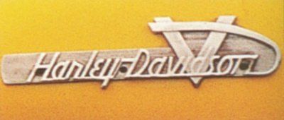
The 1955 design added a background to the script along with a large "V" to capitalize on Harley's famous V-twin motor. It's another classic.
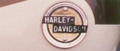
Introduced in 1957, this circular logo was fitted to the first Sportster and the first Duo-Glide. Two-toned paint was used on fuel tanks in 1956, but the schemes were more definitive for 1957-1958.
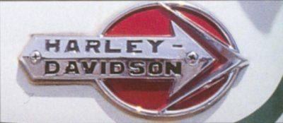
The 1959-60 arrowhead logo was larger and more colorful that the previous one, and seemed to play off the 1947-1950 design.
Advertisement
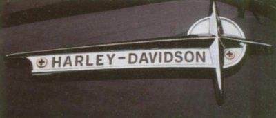
The 1961-62 "gun sight" logo was arguably less attractive than its arrowhead predecessor, and certainly less colorful.
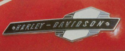
Though the up and down arrows defy explanation, this badge from 1963-65 gained notoriety by gracing the first Electra-Glide and the last of the Panheads.
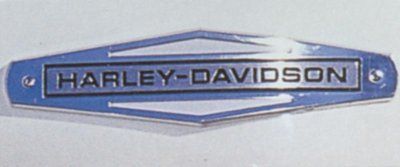
Harley returned to a plain, simple badge for 1966 that carried on into the AMF years, through 1971. It enjoyed a long life by Harley standards of the day.
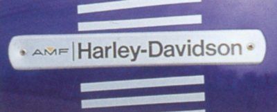
Harley aficionados didn't particularly like the Motor Company's association with a sporting-goods manufacturer, and the addition of "AMF" to the tank badge in 1972 didn't help matters any. Most were quickly removed. Graphics became more diversified at this point, with several different logos appearing in a given year.
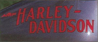
The first 1977 Low Riders wore graphics that mimicked the lettering used on a 1917 racer -- adding the requisite AMF logo, of course.
Advertisement
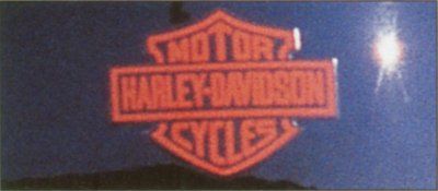
Finally out from under the AMF corporate umbrella (Harley management bought back the company in 1981), the 1982 Sturgis proudly wore the Motor Company's famed "bar and shield" logo -- sans AMF addendum.
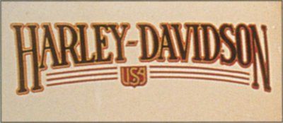
It was only appropriate that decals mimicking designs of old graced the retro-look 1988 Softail Custom.
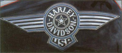
Harley could have put almost any tank logo on the special-edition "Cow Glide" and it would have sold out, but this aviation-themed winged badge just added to the 1993 attraction.
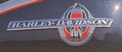
Some 1993 models were given 90th anniversary graphics, including the Wide Glide.
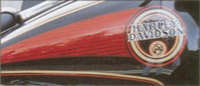
Not only were there numerous different tank designs each year, but they were all very attractive, too -- as evidenced by this decal from a 1994 Ultra Classic Electra Glide.
Advertisement
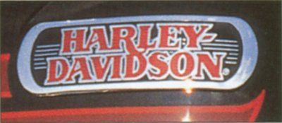
The 1995 Bad Boy wore an enameled metal badge reminiscent of a piece of jewelry. It was exclusive to this model and graced the Bad Boy's tank throughout its three-year life.
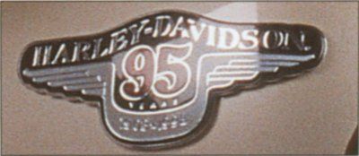
Many 1998 models could be ordered with 95th anniversary trim. Though the badge and color combination (deep maroon and champagne) were the same on each, the outline of the two-toning differed from model to model. Explore more Harley-Davidson history and then test your Harley-Davidson knowledge.