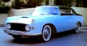
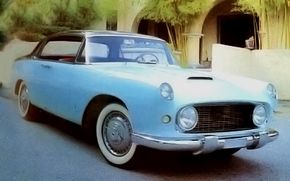
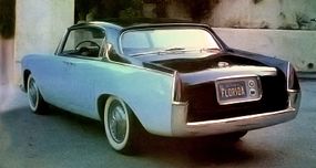
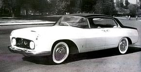
In the 1950s, Italy's design maestro, Pinin Farina, changed the shape of automotive architecture while drumming up new business for his expanding carrozzeria. Here's the story of the dramatic show car -- the 1955 Lancia Florida -- that touched off a worldwide styling revolution with an influence you can still see today.
Advertisement
The Lancia Florida is now some 50 years distant, so its colossal significance may not be fully appreciated by today's style-conscious observer. Yet few design studies offer such a clear-cut example of a truly new form.
There was nothing like the Florida in Pinin Farina's earlier work, and the maestro certainly didn't copy it from any of his rivals in Turin, London, Milan, or Detroit.
When he sprang his surprise on the world at the Turin Salone dell'Automobile in the spring of 1955, everyone was unprepared. And no one could grasp at that moment how much the Florida would influence the art of car design in years to come.
If that sounds like an exaggeration, it's not. With the Florida, Farina bid farewell to "monolithic" shapes and said hello to a new principle: body development by symmetrical juxtaposition of curved panels.
Look at it this way: If older cars were sculpted, as if hewn from a lump of clay, the Florida was just the opposite. It was built like a house of cards, each card preformed to a certain aesthetic concept. The starting point was not a solid object but merely a surface.
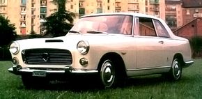
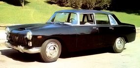
The Florida was remarkably clean for its time. The major theme was form, with a near-total absence of decoration. Horizontal emphasis was provided by the beltline, which picked up from the front fenders and stretched into the high rear fenders, blending with the backwards sweep of the C-post.
Further strengthening the horizontal motif was a full-length sheet-metal crease just above the wheel cutouts. A hardtop coupe built in steel, the Lancia Florida also featured a wraparound windshield and "dogleg" A-posts, prompted no doubt by the contemporary U.S. styling fad originated by General Motors.
The grille was not new, being merely a variation on the flattened oval that Farina was using on so many Ferraris. Headlamps were housed within the grille frame, with smaller auxiliary lamps recessed into the front fender tips.
In proportions, the Lancia Florida was perfect for its time. The profile was long and sleek, and rear deck length was sufficient for full visual balance with the hood, thereby giving extra emphasis to the car's static 50/50 unladen weight distribution.
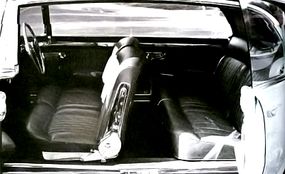
The shallow greenhouse and big wheels may look dated to modern eyes. However, those wheels -- shod with Michelin X 165-400 tires -- seemed smaller than expected for a 104.3-inch-wheelbase car in 1955, and the absence of fixed B-posts counteracted the low roof, giving a definite airiness to the interior. The prototype was originally finished in two-tone paint, with white on the roof and decklid and dark blue everywhere else.
How was this amazing vehicle created? Learn more about the Lancia Florida's design on the next page.
For more information on cars, see:
- Classic Cars
- Muscle Cars
- Sports Cars
- New Car Search
- Used Car Search
Advertisement
